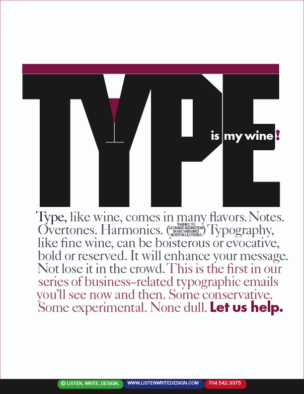
| Bold plus conservative. A good formula (not that formulas are good) for large ads. There is a terrible typographic tendency of late to have several headlines and no focal point on a page. The designer's job is to cause the viewer's eye to travel where the designer wants, and a series of competing focal points makes that difficult. A little lead footed creativity can be a good thing. | | |