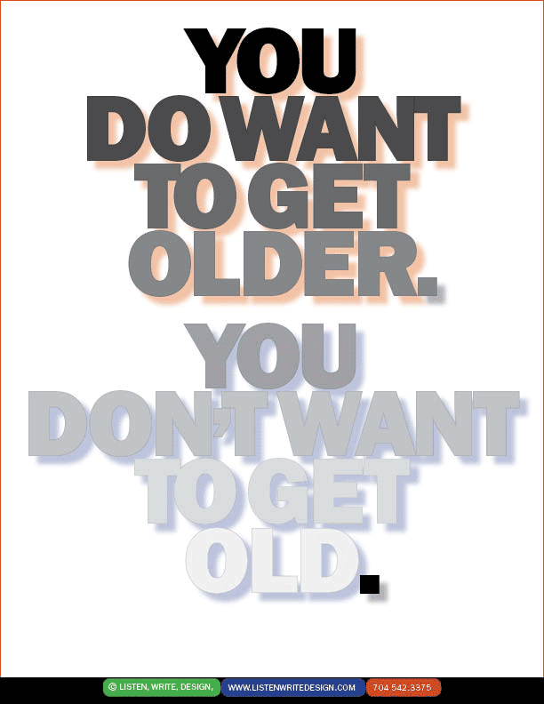
| Poetry in type. Typoetry. A delicate battle cry. And a violation of expectations: Instead of a fragile font for fragile seniors, the boldness of always excellent ITC Franklin Gothic, its weight gracefully carrying the tonal change. The red tint drop shadow on the top half, the blue drop shadow below lift it off the page gently. And the black final period?—what does that suggest? | | |