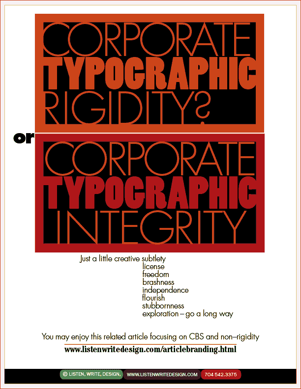
| What's the best way to express a comparison? In this case, a diagram, or a Before-and-After illustration. Two typefaces that would not normally be combined successfully were combined (Futura and Poplar). And a subtle color change took place. Corporate image building / branding need not enforce typographic rigidity in a company. Sometimes taste is a more powerful engine of consistency than is "a foolish consistency." (Keep the drummer, change the beat.) As to branding, we call it a noun not a verb. Try the "articlebranding" URL just above. | | |