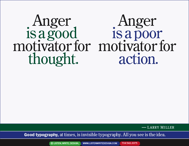
| | This simple page was one of the hardest to do. Simple is tough! The typographic solution had to reflect the duality in the idea. It could not upstage the idea but had to enhance it. Quietly. And still look gently sophisticated and thoughtfully designed. Subtly it had to look basic, not elegant. Deletion and paring away are the esthetic, leaving only the core message, in the right style. It's a good exercise for a poster or book jacket or full-page ad headline. Two typographic tricks: line spacing (leading) is not the same throughout: it's been adjusted to compensate optically for ascenders and descenders so it looks even. And: the periods are "hung," not centered. | | |