Back to portfolioPackaging.html
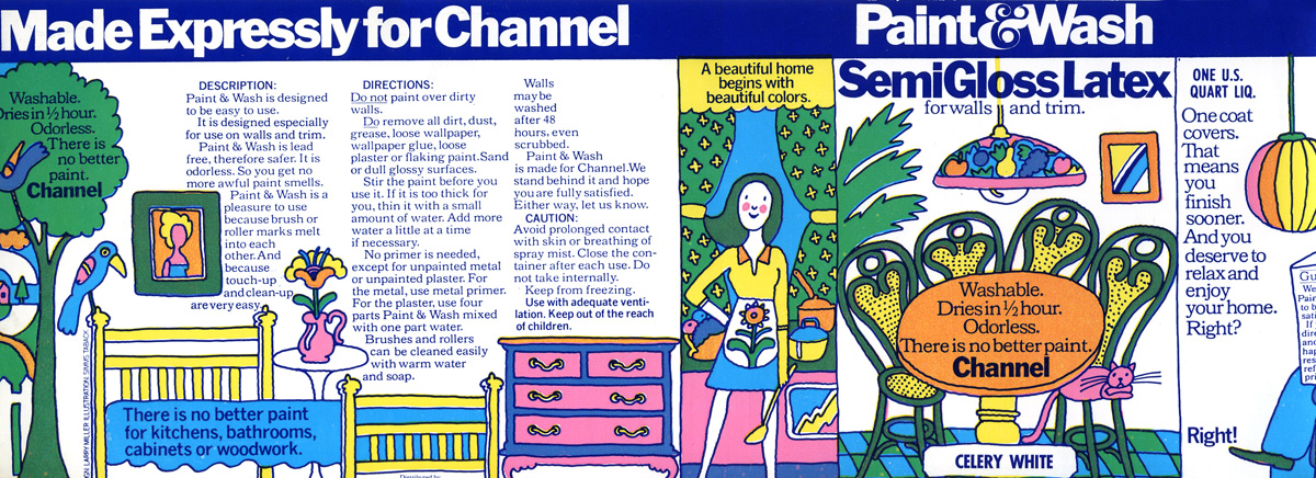
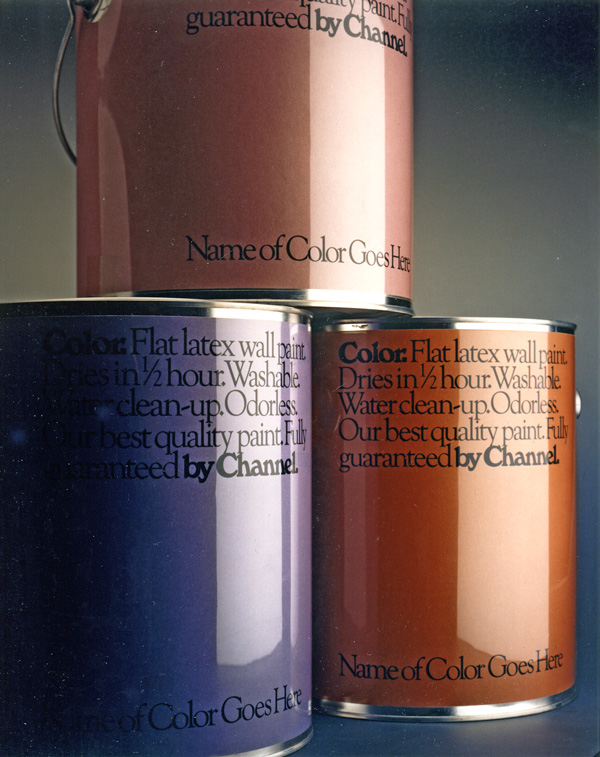
Colors (the packaging design concept, not the cat) was innovative. Instead of the typical small circle of color on the top of a can, our entire label was the swatch so a buyer could better judge the final result. Typographically, the unusual combination of the elegant Goudy Old Style and gutsy Windsor worked.
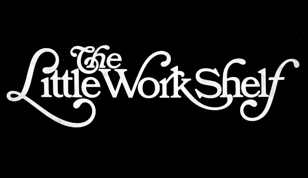
Finally a logo as part of a packaging program. Bookman swashes were refined by letterer Joe Sundwall. Note how the curved ending of the cap L serves as the dot on the i.