Back to portfolioBrochuresPromo2.html
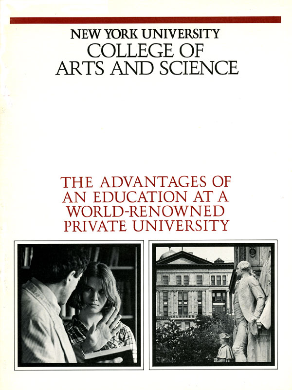

Thus we asked photographers to reverse the usual approach, which is: show students and teachers in their environment. And instead, feature the environment, along with students and teachers. It was a conceptual approach to the photography.
In addition, the typeface used throughout, Trump Medieval, not only sounded but also looked European, with a certain Classical character.
A small point: The paper was not pure white (though it looks white here), but had a slight beige cast to give it some maturity. Paper selection can indeed make or break a job.