Back to portfolioNewsletters.html


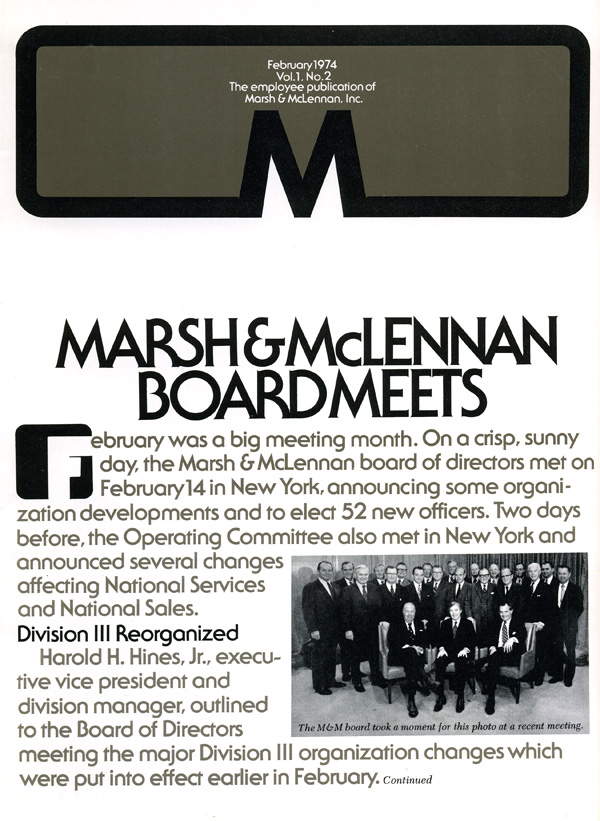
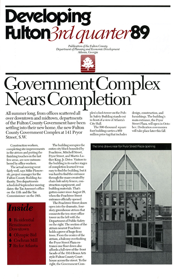
Taste, invention, boldness, white space, visual risktaking. And supertight cropping of photos (watch how 60 Minutes handles its closeups for a good example). These all help.
One more thing: The designer should never be afraid to tell the writer to cut copy. Ask. Or tell. The people who write these things often don't know about empty words to be avoided, about fancy words to be avoided. (The cliché example: "Don't utilize 'utilize' when you can use 'use'.")
And remember: a spellchecker ain't the same as a proofreader.