Back to portfolioCorporateLogos.html

marino & marino corporate logo stationerey marino & marino corporate logo stationerey
rhodes furniture marketing concept
Marino&Marino were great typesetters. Why, we asked, should a logo for a type shop consist of only one or two fonts when their type library is vast? We gave them two M's in the middle of the alphabet and, with that as the design constant, and with an open deadline, explored a variety of styles, periods, and typefaces.

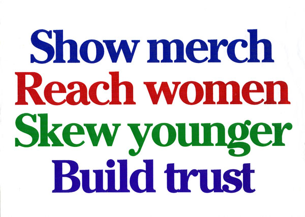
For Rhodes, a furniture chain since bought up, we suggested what you see—not a graphic approach, a marketing framework. An assignment may go in a straight line, or it may have some interesting and productive side roads.

Most important function we provide:
define the problem properly.