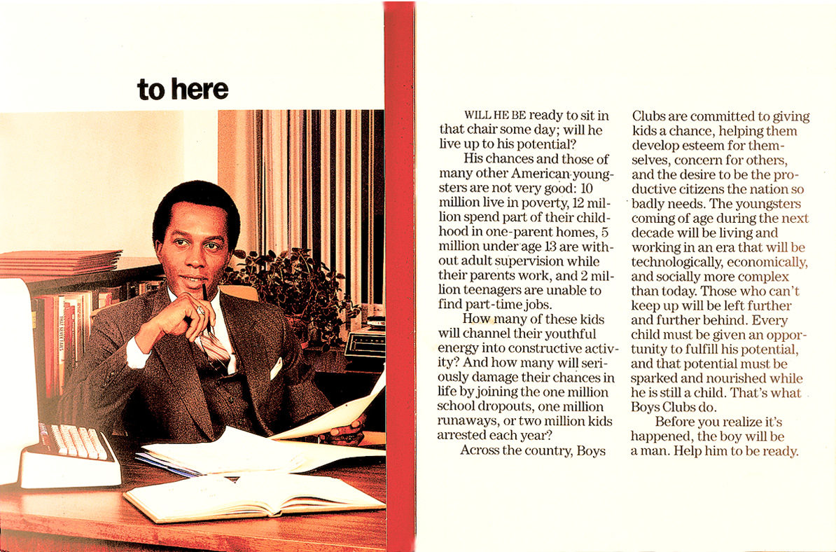
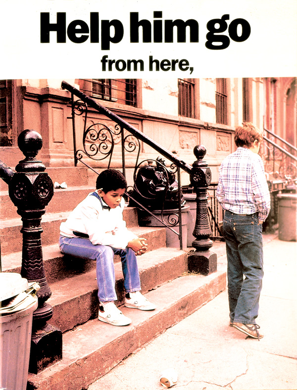
Back to portfolioBrochuresPromo4.html

Left and below, a more corporate flair for a 16-pager all about the Clubs and their facilities. The cover folds in and below it, the russet-colored page is a bold headline.
We at Listen, Write, Design, are strong believers in dynamic creativity mixed with respect for the busy and inundated reader. Pick up most any magazine or newspaper today and see the art direction fail at its most basic level: directing the eye of the reader.